Bill4Time v2.0: First Impressions
10/22/2009 By Bill4Time Staff
The creators and developers of Bill4Time time tracking software have been working day and night to bring you V2.0. And it is almost here! Around the office, we are doing some internal beta testing – and that includes everybody! Now I’m not a web architect or a developer. I’m just a regular user who’s attention span is only so long (or short). If I find something beneficial, such as good time management, I will take the time to learn something. But after a while, I’d need a little rest. Sound familiar?

However, the new version of Bill4Time is pretty easy to navigate through! I actually had a bit of fun with it. A lot of it is pretty straight forward, though there will be upcoming video tutorials, articles, and tips to help everyone become familiar with it. With only one session with the beta version, I feel like I’ve had a deeper understanding of this time tracking software. It does more than just track your billable time, it’s a project management tool, an invoicing machine, and a valuable business efficiency assistant.
Mind you, this is only a peek into the 2.0. It’s not at its final stage but I’m far too excited not to let you in on the great things to come.
Color Scheme
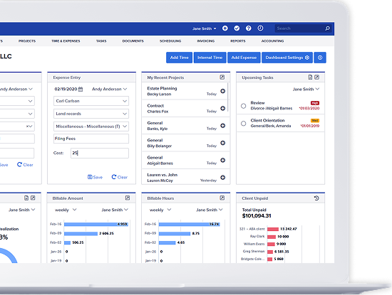
Let’s start with the first things you’ll notice. The color scheme is very easy on the eyes. It encourages a smooth experience in your time billing management. The navigation is wonderful and very intuitive. There are navigation buttons on every screen so you aren’t always at the mercy of the Dashboard.
Summary Chart on Dashboard
You’re welcomed with a Weekly Hour Summary giving you a chart of the billable hours you yielded per week for the past 8 weeks. A little trick is to hover your cursor over a specific point on the graph to get the exact number for that week.
 Efficiency on Sight
You’ll also see a Recent Activity list of the most recent time entries into the time tracking software. At a single glance you are brought to speed on the latest progress of your business. And to complement this list, you’ll have right next to it, a list of projects easily sorted by most recent activity. So before clicking anything on the dashboard, you already have access to the most recent projects you’ve been working on. How efficient is that?
Customizable Logo
My personal favorite feature is located at the top right corner. By default, you will see the Bill4Time logo, but you can upload your own logo! My little trick for the consultants or the smaller firms with a playful business culture: you don’t have to upload your company logo (save that for the Invoice Logo option). You can have a little clip of your favorite picture to greet you when you track and bill for time. This makes your time tracking software more personal. It already helps unify the entire business, so why not just one more thing to bring everyone together?
Next time… a sneak peek into the intuitive organizational structure.


