The New Bill4Time: Layout Enhancements
11/19/2009 By Bill4Time Staff
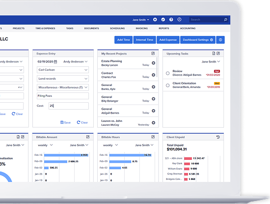
The eye naturally moves left to right. It’s what’s most comfortable to us. That lead to the developer’s decision to move the navigation menu from the left side of the Dashboard to the top of every screen. There is nothing wrong with a vertical list, but when it comes to looking at organization, a horizontal layout is easier on the eyes.
We also naturally prefer to have left and right margins. Perhaps it has something to do with our many years of working on documents with one inch margins all around. The new version responds to this natural preference by centering the layout, providing side margins on both sides. It’s actually a lot easier to focus on the contents of the screen.
Action buttons are really helpful too. These buttons were always there, it’s just that they are bigger and easier to see now. I particularly appreciate the little icons on the buttons, it helps to quickly identify the button you need.

Navigation Always Available
At a single click you can jump from the Clients screen to the Accounting screen or from wherever you are in the system to the System Settings screen. All of the main categories are on every page. Not only does this eliminate the task of returning to the dashboard, but it also maintains your train of thought while using the system.

Bread Crumb Trail
In the new Bill4Time, you will find a “breadcrumb trail” so while you are working through the system, you will always be able to retrace your steps. You are never too far from where you started.

If you haven’t tried out the new version yet, we recommend you take a look.


