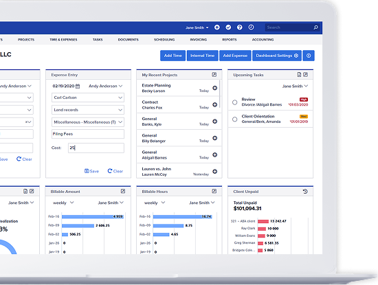
Bill4Time is excited to reveal our updated look and new design! In the top right you will see the “Preview New Bill4Time” link. This will allow you to get a first look at the new design which includes:
- An updated modern visual design
- A consistent look and feel across the system
- Best of all, full use of your display size!
This new version of Bill4Time is just the first of many exciting new updates and features that will be available in the coming months. We’ve been working hard to make the new version faster, easier to navigate, and more user-friendly. It has been crafted to reflect the needs of you, our current users, but also builds upon technology capable of addressing your future needs and growing with your business.
We encourage you to sign in and go through your normal workflows, as we put a sincere effort into making the new version as seamless a change as possible. The new website is full of helpful resources that are located at the top of every page. At the bottom of any page in the new version, you will have an option to switch back to the Legacy version of Bill4Time during this preview period.
We would love to hear your feedback on Bill4Time’s new look and feel! At the top right, click the question mark to access the Bill4Time Support Center where you can submit a support request and send us your feedback.
We are looking forward to the future, and are dedicated to the goal of making Bill4Time the best timekeeping and billing system available!
Owen Gabrielson says
We sure would sure like to see API’s or something allowing our other systems to be able to pull data/link w/ B4T…
Kristin O'Neill says
Hello Owen, this is definitely something we are working on for future updates so as soon as we have this available we will notify all users!
Dawn Faciane says
Howdy Kristin! I had sent the following to Patrick but I thought I’d send it to you too.:
I am now trying out the new version. I’m still wondering why we can’t use a phone number in the search box to find a file – that would be extremely convenient. I do use the conflict checker to find a file by phone number, but it will only find the number if it was entered into a schedule item, not just as part of the client’s profile. I would rather be able to enter the phone number in search.
Also, with the new version, the schedule report leaves a lot of wasted space and with the simplified version, wastes too much paper. Would like to be able to adjust the individual columns as needed to fit on the page.
Would still like to have an automatic roll-over feature option – i.e.: if a schedule item is not marked completed, it automatically rolls over to the next day. However, that would only be convenient in certain circumstances, but still convenient.
Thanks! Y’all keep on doing a great job for us please!
Dawn Faciane for Chris Munz
Note to Kristin, Patrick sent back a suggestion of how to use a project deadline to roll-over schedule items but I haven’t tried that yet.
Thanks & you keep up the good work!
Kristin O'Neill says
Hello Dawn, thank you for the feedback! We definitely have some major Scheduling updates happening in the future that we are excited about so as soon as this becomes available we will notify all users! For any further feedback or issues you find make sure to email us at Support@Bill4time.com
Susan LaCava says
how do I switch to the new design?
Kristin O'Neill says
Hello Susan, at the top right of any page click the Preview New Bill4Time link if you haven’t already!
Milena Motta says
Hi Kristin, it´s Milena here, from UNO Trade. You helped me in a couple of times when I was facing some problems in our B4T account. The new B4T seems to be nice and very well designed.
Very well done!!! Congrats for you and your team!!
All the best from Brazil!!!
Kristin O'Neill says
Hello Milena, thank you so much for the feedback! We definitely have some amazing updates in the future so we are excited for our next chapter!
Violet Dodds says
Hi Kristin,
When will the new design be available ?
Thank You
Kristin O'Neill says
Hello Violet, the new design is available now to test! At the top right of any page click the Preview New Bill4Time link if you haven’t already!
Jennifer says
Not sure where the correct place to put this comment:
Previously, when you’d enter a batch of time, the Batch Time Entry screen would pop-out in its own window. This is no longer an option and it defaults to opening within the same window. Would it be possible for a “pop-out” option. It was easier to enter batches of time when I could control the size of the compact, pop-out window.
Kristin O'Neill says
Hello Jennifer,
Thank you for your comment. I will pass this over to our developers. Any future suggestions you can email them to us at Support@bill4time.com
Erin Smith says
Since using the new design, I have noticed that Bill4Time will log me out periodically, even when I am constantly using it throughout the day. For example, I will be in the middle of creating a time entry, and once I hit “Save & Close”, I will get an error screen saying I am not logged in, or the webpage will crash. This hasn’t happened while using the old design.
I do like the new design, especially the Time & Expense tabs, which I use more than the other tabs.
Kristin O'Neill says
Hello Erin,
Thank you for the feedback. I will create a ticket from this and you will receive my follow up question shortly.
here says
I think this is among the most significant
info for me. And i am glad reading your article. But should remark on few general things, The website style is
perfect, the articles is really excellent : D. Good job, cheers